SANTO DOMINGO – We live in times when we want to take care of our well-being in different ways: eating well and exercising to look good and feel better. Many of our consumption decisions are made in seconds; we might check the price, the expiration date, and that's it.
Many of us are unaware of the science behind the labels on mass-market consumer products. It's a mysterious language that most people overlook or ignore, either because they don't understand it or because they don't care.
In addition to the nutrition facts panel and the contents list, there are a number of symbols that convey essential information to users and consumers. These symbols, icons, and colors form part of a code designed to guide, persuade, or warn the consumer.
Ultimately, manufacturers are trying to protect themselves, especially in countries where a lawsuit could arise from non-compliance with certain quality regulations.
Learning to interpret this symbolism is a form of re-literacy, which goes beyond simply understanding what "no added sugar" or "gluten-free" means; it involves recognizing the implicit messages that the food and cosmetics industries place in our hands.
It's not a Dan Brown book, but…
Each symbol contains important information. For example, the green circle with a leaf not only suggests the "naturalness" of the contents, but also creates an image of good health and sustainability, even if the product has undergone a long industrial transformation process.
The metal container with a quality seal or certification number is not just a bureaucratic formality: it is also a commitment to trust, a way of reminding us that someone, somewhere, guaranteed its safety.
There is also a symbolic aspect that appeals to emotions and aspirations. The illustration of red, juicy tomatoes in a can, for example, is not meant to inform us, but rather to evoke freshness, harvest, and tradition.
Even though we know those fruits have spent months in processing machines and preservatives, the gold color on the lid might suggest prestige or "premium quality," even if its contents are practically identical to those of a simpler can.
The symbolism on labels is a hybrid language, blending the technical with the emotional, the legal with the aesthetic, and reminding us that every time we choose a can at the supermarket, we're not just buying food: we're also buying a story.
Learning to read these codes with a critical eye doesn't mean distrusting everything, but rather reclaiming an active role in the act of consuming. In the end, labels speak. The question is: are we listening?
Labels on canned food
In a supermarket, when we pick up a can, we rarely look at the small information map on the label. It contains not only nutritional information but also a series of symbols that, if we know how to interpret them, can help us make better consumer choices.
One of the most important elements is the expiration date . It appears in numbers, sometimes accompanied by abbreviations such as EXP (expires), CAD (expiration date) or BEST BEFORE (use by).
It is important to know the difference between " use by " date, which indicates the safe limit for consuming the product, and " best before" date , which indicates how long the food maintains its best quality, although it can still be consumed safely afterwards.
In addition to the date, canned food labels include key messages with symbols:
- The fork and the glass guarantee that the container is suitable for contact with food.
- The recycling symbol (three arrows in the shape of a triangle) indicates that the container can and should be recycled.
- The green dot , a circle with two intertwined arrows, means that the manufacturing company has contributed to a recycling system.
- The crossed-out ear of wheat – symbol of “suitable for celiacs” – is present when a product does not contain gluten.
- The vegan or vegetarian icon (usually a green leaf) indicates the absence of ingredients of animal origin.
These symbols are not mere decorations: they offer universal information that complements the label text. Reading them correctly is learning a visual language that helps us make more responsible and conscious consumption choices.
The next time you have a can in your hand, stop for a few seconds. You'll see that the label not only tells you what's inside, but also how to care for it, how to recycle it, and even what kind of lifestyle it promotes.
Cosmetics too
If you thought it was only in food, you're wrong. Cosmetic labels say much more than the ingredient list: they're a visual language that helps us use products safely and responsibly.
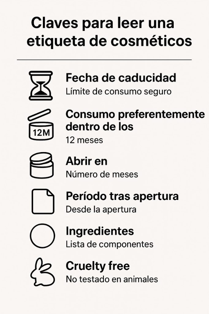
But you've probably never noticed or stopped to try to understand the symbols that appear on the labels of creams, shampoos, or lipsticks.
One of the most common symbols is an open jar with a number and sometimes a letter inside, indicating the PAO (Period After Opening) , which tells you how long the product maintains its quality once opened. Three years later, you have that expensive cream on your vanity that you use little by little. If you look at the label, you'll probably find this symbol and "12M" (Use within 12 months of opening).
There's also the hourglass or expiration date, which indicates until when the cosmetic can be used safely. It's important to pay attention to this information, as many allergies are caused by products that have passed their expiration date.
Other very useful symbols include the bunny , which identifies products not tested on animals; the recycling symbol , which reminds us where to take the packaging; and the hand on a book , which indicates that additional information is available in the leaflet or on the box. Yes, you should read them.
By reading these icons, we learn to take better care of our skin and, at the same time, the environment. A small gesture of paying attention to the label allows us to choose consciously, extend the lifespan of products, and reinforce responsible habits.